It goes without saying, but we spend a lot of time browsing websites; shopping, ordering food, booking services or a reading articles (just to name a few). A good website should be functional and easy to navigate - while also looking visually appealing and on brand. If you are in the process of re-designing your website, or creating a new website from scratch, then we highly recommend you follow these five key web design principles.
Use Readable and Web-Friendly Typography
Typography should never be dismissed when designing a website. As one of the key web design principles, the right font styles can help to demonstrate your brand personality, while also being functional and readable for your audience. Two key font classifications most web designers choose from are ‘serif’ fonts and ‘sans serif’ fonts.
‘Serif’ fonts typically have small decorative features at the end of a character’s stroke. The most popular font types under this category are Times New Roman, Georgia and Playfair Display. As a traditional, classic font type, a business may choose to use a ‘serif’ font if they want to appear more reputable, established and even high-end.
‘Sans Serif’ fonts do not have extending decorative features at the end of a character’s stroke. This font type uses simple, clean lines that are the same width. This font type suggests a more casual, friendly and modern approach to a website. They are often associated with cutting-edge businesses like e-commerce or tech companies.

For a pleasant reading experience, factors like type size, colour, formatting, line height and line length are all elements that should always be considered.
One particular formatting element in typography is kerning: the amount of space between two letters or characters. Kerning can drastically impact your website’s appearance and readability. You may find that a font’s default kerning isn’t ideal for some letter combinations - for example, letters might sit too close together or too far apart. Website hosts like Wordpress allow you to use custom CSS to adjust the spacing between the letters. But make sure you consider letter spacing and adjust accordingly when creating the actual design.

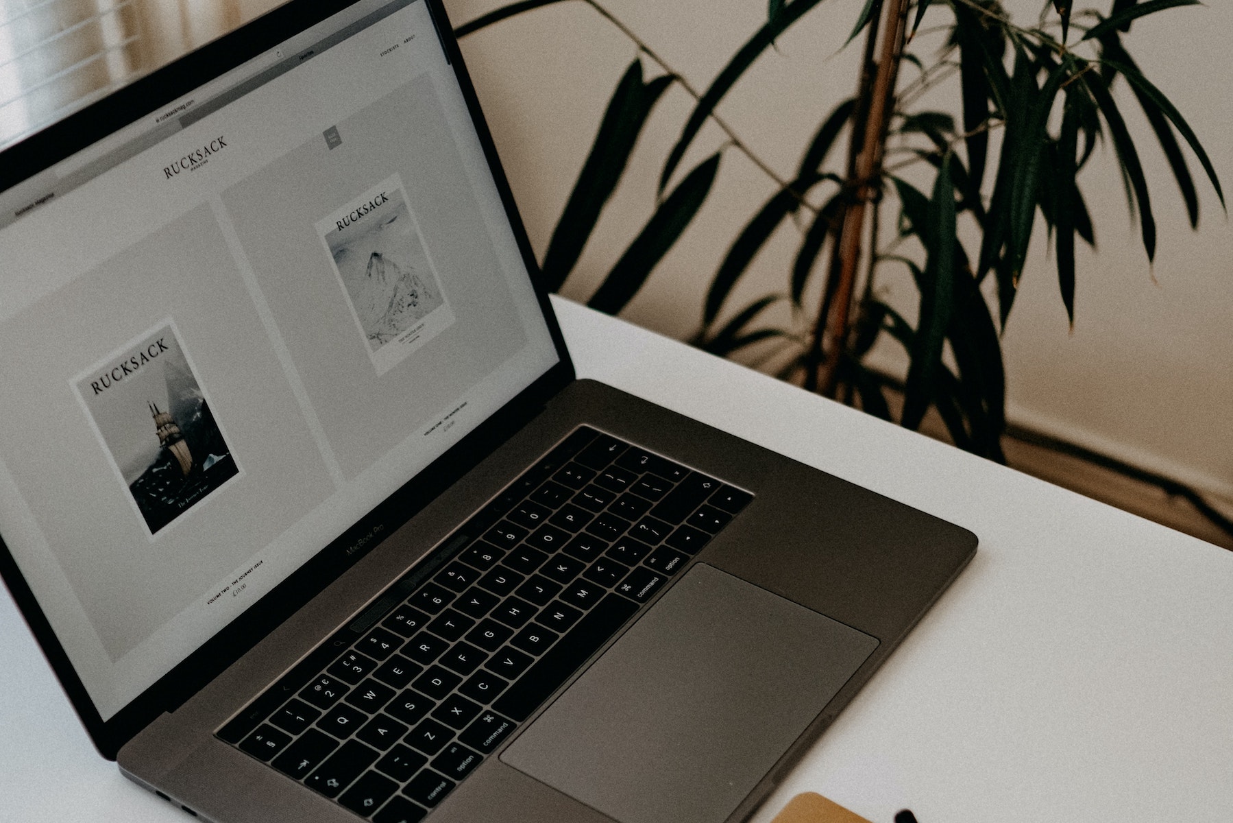
Image via Canva
Visual Hierarchy
It’s all well and good for a website to look aesthetically pleasing, but one of the key web design principles is that it must also be logical. Visual hierarchy is the prioritisation and arrangement of content in order of importance to help direct the user’s attention and make information easier to consume.
Visual hierarchy can be achieved using some of these techniques:
- Size: different scaled elements will guide the user’s attention - the larger the element, the more attention it will attract;
- Alignment: create alignment between elements with columns and grids;
- Whitespace: this helps to separate elements and draw attention to certain pieces of content;
- Page scanning patterns: eye-tracking studies that show where users focus their gaze once they land on a page.
Eye-tracking studies have discovered that there are two predominant patterns users follow when scanning web pages; ‘Z’ Pattern and ‘F’ Pattern.
A ‘Z’ pattern design follow the route of the human eye when they read - left to right, top to bottom. First, users scan from the top left to the top right (a horizontal line), then down and to the left, creating a diagonal line, and finally, back across to the right again (a second horizontal line). This particular type of design is best suited for pages that focus on simplicity and minimal copy, for instance, a landing page. A common layout might be the logo in the top left corner, some key information across the first horizontal line (i.e. menu items), high quality images in the middle and a compelling CTA at the bottom. If you would like to adapt this type of pattern, remember the following:
1. What do you want your audience to notice first? Your logo and what you offer?
2. What do you want them to do on this page? Submit their details or sign up?
An ‘F’ pattern design typically focuses on text-heavy websites like blogs. This particular pattern dictates that visitors first read a page in a horizontal direction, usually across the upper part of the page. Then, they scan down the left side of the screen until they come across a heading or something that catches their eye, and read across a second horizontal line. If you choose to use this pattern, remember to put the most important information at the top of the page.
Easy Navigation
Users should easily be able to navigate themselves around your website. Poor navigation can potentially impact your sales and bounce rate, so make sure to create a clear, hierarchical website navigation that is easy to use and works well across all devices. There are various types of navigation menus - menu in the website header with dropdown functionality, sidebars on the left or right of a website and hamburger menu (simple three line icon often used in mobile web design).
Some best practices to follow:
- Plan the order of your menu strategically and logically;
- Make everything clear for the user. This includes font type, design, navigation titles (i.e. ‘About Us’);
- Make sure your navigation menu is easy to use on mobile devices;
- Include a search bar;
- Consider using breadcrumbs (a secondary navigation menu that reveals the user’s location on the website).

Colours and Imagery Set the Tone
Colour and imagery are some of the most powerful web design principles to gain a reaction from your target audience.
The right colours can set the mood for your website and stir emotions. For example, warm colours can create a joyful, happy feel, while cool colours (particularly blue) stir emotions of authority and trust. To create a colour scheme, choose your dominant colours (they can either complement or contrast each other), then choose your accent colours (usually applied to navigation menus or CTAs), and don’t forget your neutral colours (black and white for text and backgrounds).
Imagery can serve many purposes in web design. An image can tell a story, demonstrate how a product works or show who is behind the business. Be sure to select high quality images that match your overall aesthetic and have a clear purpose on your website.
Responsive Design
Mobile devices account for approximately 50% of web traffic worldwide, so it’s becoming increasingly important to make sure to create a responsive design that works on mobile devices just as effectively as it works on laptops, desk top computers and iPads. Make sure your header text, paragraphs, font size and letter spacing work well across all devices. Stack any column content into rows for better vertical flow. Any buttons or CTAs should also be easy to use on a small screen.
Want More Web Design Principles?
There are plenty more web design principles to follow, but these are the key principles to get you going on your web design. Need assistance designing and building your website? Our team can help you design a brand new website, as well as develop and build your website, making it completely customisable to suit you and your customer’s needs. Please get in touch to learn more about our web design services.